
Düssel York City Logo
When I started working on my Adobe Portfolio site I thought now would be the right time to brand myself and my work. My following has grown via Social Media, so when creating a new site to showcase my portfolio it made sense to create a logo for myself.
The Concept
I am a New Yorker that is currently living in Europe, thus I wanted to create a brand identity for myself that reflects my experience. Having lived in NYC for a majority of my life, it is a place that I will always hold dear. When I moved to Germany in 2012, I began exploring the European experience. Taking in the sites, culture, sounds, tastes, images, textures and life. This has become apparent in some of the artwork that I create.
Because I am able to combine the New York style with European trends the idea of a global experience has become relevant in my life. This is how the concept of Düssel York City was formed. Even if I do not stay in Düsseldorf this global outlook will follow me in my journey.
The Creation
I am a creative that is multidisciplinary and wanted a logo that was created utilizing more than one medium.
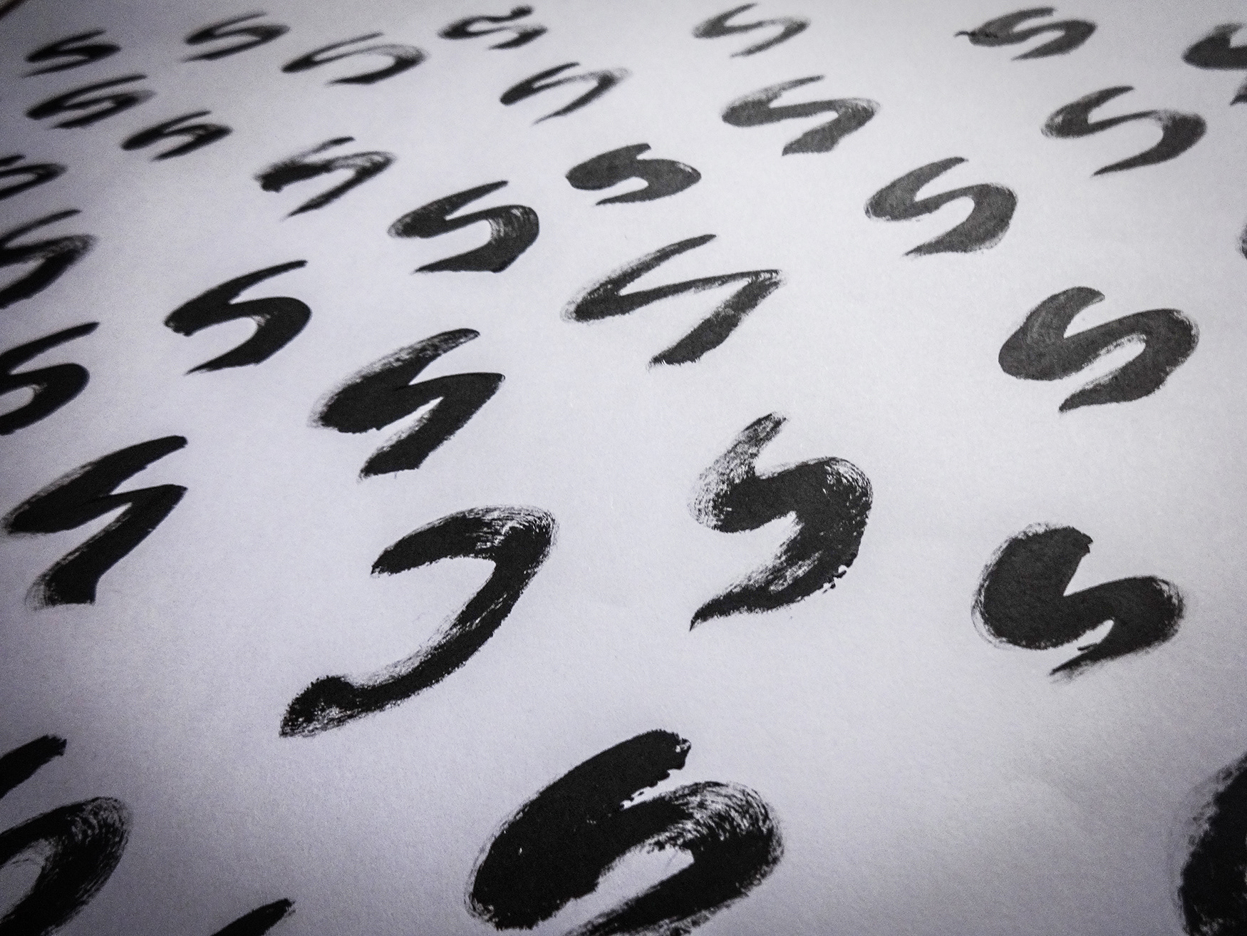
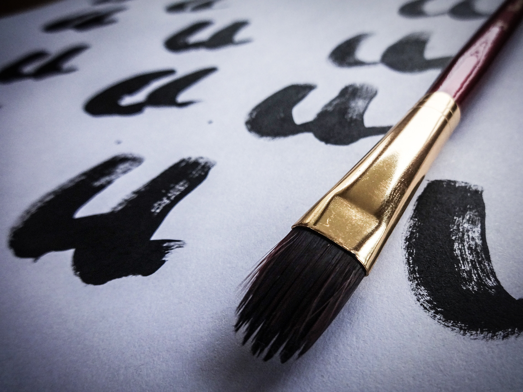
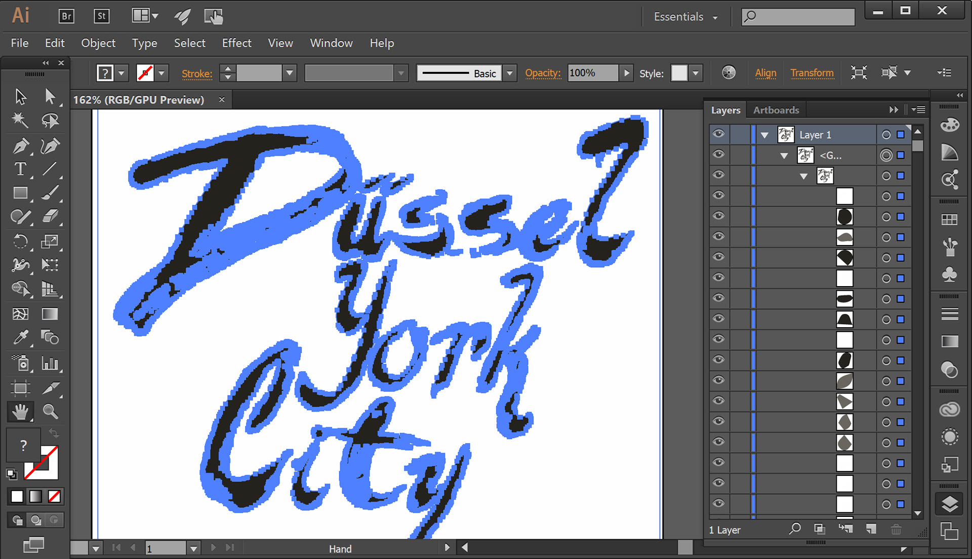
Because I have a traditional art background, I decided that I wanted to create the letters by painting them. I then painted several versions of each letter. Since I also have a background in photography, I thought it would be better to photograph the letters as opposed to scanning them.
As a Creative Director and Art Director, I know it is important to make the right decisions during the creative process... so I chose the letters that worked the best together. Using Adobe Photoshop and my Wacom Cintiq Companion, I put my layout and design skills into play and placed the individuals letters in a way that worked perfectly.
In my next step I took the final layout into Adobe Illustrator and did a Live Trace of the words, thus creating a vector graphic that could be re-sized. Back in Adobe Photoshop I chose three textures that could be utilized in different ways. I also ran tests to see what the logo would like in small/large scale and in black & white. Having seen that the finalized look could be versatile I signed off on the final design.
In addition, I added text that would appear below the logo when used on my portfolio. As a designer I know that sometimes additional text does not work when shrinking a logo. So this text will only appear in certain places that the logo is used. Also I have decided that I can can change the text below the logo if need be. For this reason, I used a very simple font that would not overpower the logo itself.
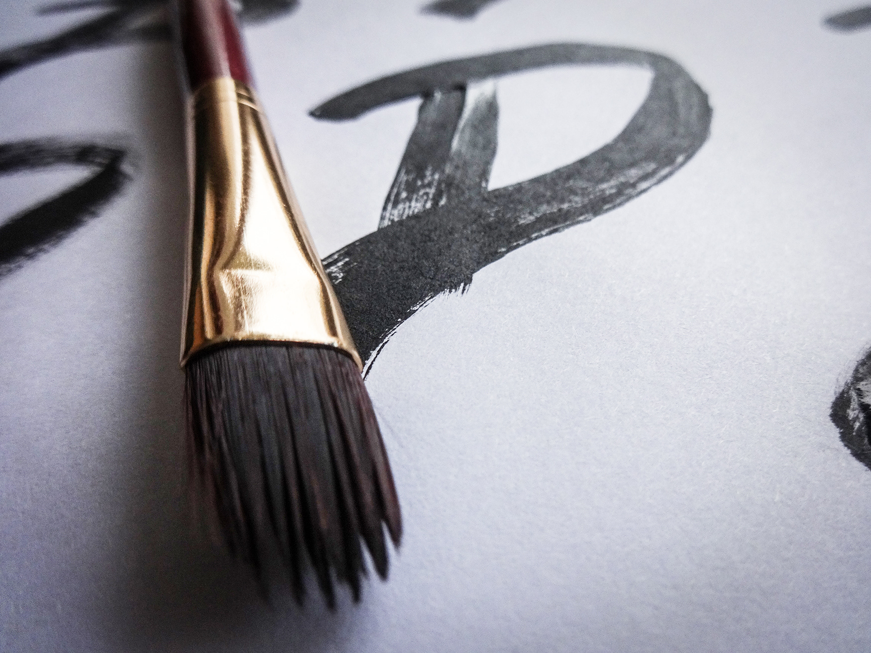
I had an idea of how I wanted the overall design to look. However, when painting the letters I found it better to test out different styles. This allowed me to later choose letters that would cohesively work together in the final design.
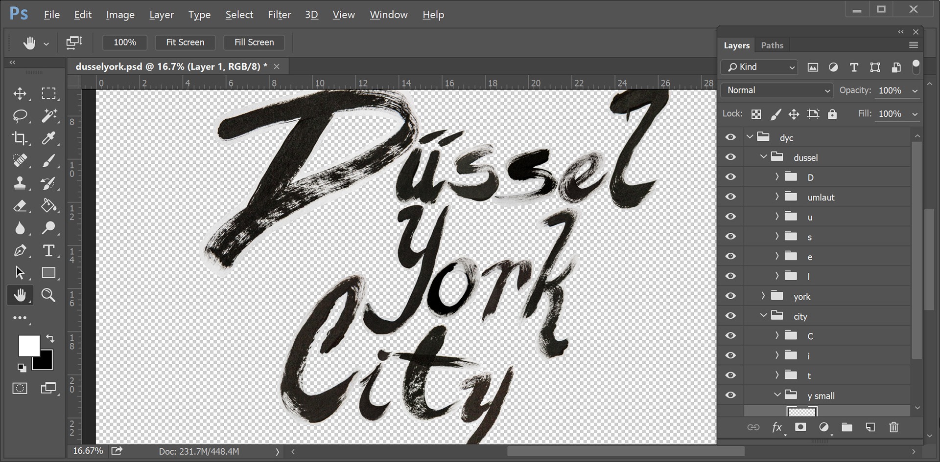
Using Adobe Photoshop and my Wacom Cintiq Companion, I was really able to work with each individual letter and create a layout that worked well.
Because I wanted the logo to be scaleable, I imported the words into Adobe Illustrator and turned them into vectors using Live Trace.
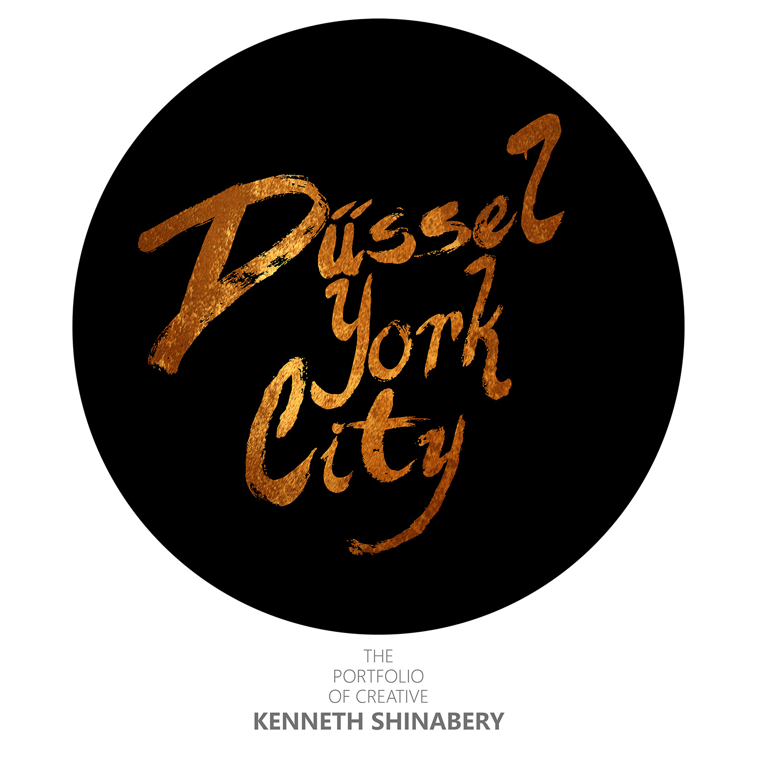
I chose three different textures for the letters that could be used at different times. Each texture has a metallic feel, thus it looks as if it was created using metallic paint that shines.
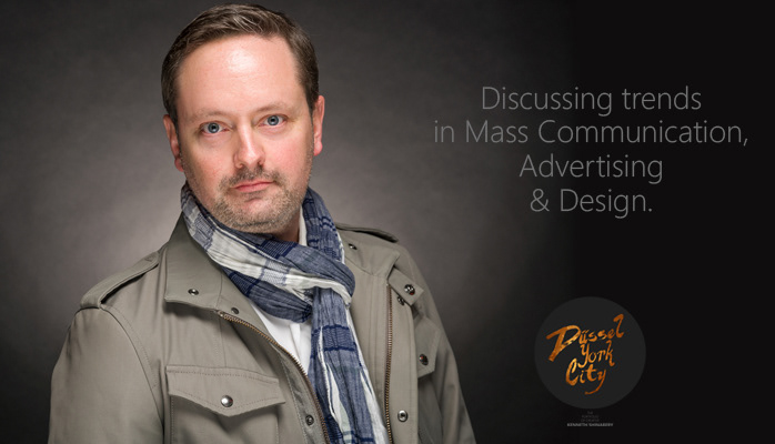
This is the new banner that I created for the articles that I write on LinkedIn's Pulse. I now have 2000+ followers for my articles, so it made sense to add the logo there prior to launching my Adobe Portfolio site. Starting the branding a little early and thus acquainting people to my new logo.
You can follow me on LinkedIn by clicking HERE.
email: kshinabery212@gmail.com